# Motion 动画
Motion (opens new window) 是一个易于上手的动画库,它独特的混合引擎结合了浏览器的高性能和 JavaScript 引擎的无限潜力。支持:
- HTML/CSS
- SVG
- WebGL
动画,而且还原生支持 React 框架。
# 安装 & 使用
$ npm install motion
import { motion } from "motion/react"
# Motion Component
为了方便在 React 里使用 Motion,Motion 提供了 Motion Component (opens new window)。每个 HTML 和 SVG 元素都有一个对应 Motion 组件,比如
<motion.div />
<motion.a href="#" />
<motion.circle cx={0} />
2
3
这些组件都是对普通的 HTML 元素的封装,但是提供了动画属性 (opens new window),便于在 React 里使用 Motion。
# Motion 基础
# 动起来 - animate
最简单的动画使用 Motion Component 的 animate (opens new window) 属性。
// 向右移动 100px
<motion.div animate={{ x: 100 }} />
2
并且当 animate 的值发生变化时,Motion Component 将继续以 animate 的值进行动画。
const [x, setX] = useState(100)
<motion.div animate={{ x: x }} />
2
# CSS 属性
Motion 动画支持所有的 CSS 属性,包括浏览器通常不支持动画的 CSS 属性,比如 background-image 、mask-image 等。
<motion.nav
  animate={{ maskImage: "linear-gradient(to right, rgba(0,0,0,1) 90%, rgba(0,0,0,1) 100%)" }}
/>
2
3
# transform 简写
在第一个例子中,出现了 x 属性,但是 CSS 并没有 x 属性,其实它是 transform (opens new window) 属性的简写,
// 等价于 <motion.div animate={{ transform: translate(100px, 0) }} />
<motion.div animate={{ x: 100 }} />
2
除此之外还有:
- 平移:
x、y、z - 缩放:
scale、scaleX、scaleY - 旋转:
rotate、rotateX、rotateY、rotateZ - 倾斜:
skew、skewX、skewY - 视角:
transformPerspective
当然也可以直接使用 transform,还能获得更好的硬件加速。
<motion.li animate={{ transform: "translateX(0px)" }} />
同样的 transform-origin 也有三个简写
originXoriginYoriginZ
# 值类型
animate 的值类型支持:
- 数字:
0100。 - 包含数字的字符串:
"0vh"、"10px"等。 - 颜色:十六进制、RGBA、HSLA。
- 包含多个数字或颜色的复杂字符串(如
box-shadow)。 display: "none"/"block"和visibility: "hidden"/"visible"。
# CSS 变量
Motion 可以为 CSS 变量添加动画效果,还可以使用 CSS 变量定义作为动画目标。
<motion.ul
  initial={{ '--rotate': '0deg' }}
  animate={{ '--rotate': '360deg' }}
  transition={{ duration: 2, repeat: Infinity }}
>
  <li style={{ transform: 'rotate(var(--rotate))' }} />
  <li style={{ transform: 'rotate(var(--rotate))' }} />
  <li style={{ transform: 'rotate(var(--rotate))' }} />
</motion.ul>
2
3
4
5
6
7
8
9
📢 对 CSS 变量值进行动画处理总是会触发绘制事件 ,因此使用
MotionValue来设置此类动画可能性能更高。
# Keyframes
animate 也支持数组,称为 Keyframes。
<motion.div animate={{ x: [0, 100, 0] }} />
# Variants
有时候一个动画可以包含多个动画属性,而且可能多个组件使用相同的动画,这个时候可以使用 Variants (opens new window),避免重复编写。
const variants = {
  visible: { opacity: 1 },
  hidden: { opacity: 0 },
}

<motion.div
  variants={variants}
  initial="hidden"  // variants 对象的属性名
  animate="visible" // variants 对象的属性名
/>
2
3
4
5
6
7
8
9
10
Variants 更厉害的地方是它具有穿透性。
**注意:**这里的穿透性是指 animate、initial(后面会讲到) 等 props 设置的 Variants 值传递给了子组件,而不是 variants props 的值传递到子组件的 variants props 上。这一点要注意,一开始我也理解错了。
const list = {
  visible: { opacity: 1 },
  hidden: { opacity: 0 },
}

const item = {
  visible: { opacity: 1, x: 0 },
  hidden: { opacity: 0, x: -100 },
}

return (
  <motion.ul
    initial="hidden"
    animate="visible"
    variants={list}
  >
    <motion.li variants={item} />
    <motion.li variants={item} />
    <motion.li variants={item} />
  </motion.ul>
)
2
3
4
5
6
7
8
9
10
11
12
13
14
15
16
17
18
19
20
21
上面例子中 ul 的 initial="hidden"、animate="visible" 传递给了子组件 li,但是要求子组件能识别 hidden、visible。这就要求它们也要设置 variants props。如果设置了 variants props,它们就能一起动画。
# 动画效果 - transition
默认情况下,Motion 会根据动画值的类型创建合适的动画效果,以实现流畅的动画。像 x 或 scale 这样的物理属性使用 spring 动画效果,而像 opacity 或 color 则使用 ease 动画效果。
但是,我们可以通过 transition (opens new window) 属性自定义动画效果。
<motion.div
  animate={{ x: 100 }}
  transition={{ ease: "easeOut", duration: 2 }}
/>
2
3
4
# 类型
transition 有三种类型 type:tween、spring 和 inertia
# tween
基于持续时间的 easing 动画。
ease
内置
easing函数名lineareaseIn、easeOut、easeInOutcircIn、circOut、circInOutbackIn、backOut、backInOutanticipate
Easing Functions Cheat Sheet (opens new window) 有一些 easing 函数可视化展示。
- 由四个数字组成的数组,用来定义三次贝塞尔曲线,例如:
[.17,.67,.83,.67],可以通过 Cubic Bezier (opens new window) 可视化定制。 - 自定义 JavaScript easing 函数 (opens new window),它接受并返回
0~1的值。
duration
动画的持续时间,默认是 0.3s。
times
当动画多个关键帧(Keyframes)时,times 设置每个关键帧持续时间,0~1。
<motion.div
  animate={{
    x: [0, 100, 0],
    duration: 1,
    transition: { times: [0, 0.3, 1] }
  }}
/>
2
3
4
5
6
7
从 0px 移动到 100px,持续 0.3s,从 100px 移动到 0px,持续 0.7s。
times 的个数必须和关键帧的个数相同。
# spring
弹簧动画。它有两种模式:
一、基于物理弹簧特性,通过设置 stiffness(硬度)、damping(阻尼)和 mass(质量)模拟物理弹簧的动画效果。
二、基于持续时间,设置 duration(持续时间)或者 visualDuration(视觉持续时间)和 bounce (弹力)。
动画效果可以参考 Motion - Spring visualiser (opens new window)。
# inertia
惯性动画,根据初始速度减缓物体速度的动画,通常用于实现惯性滚动。
这个类型的参数比较多,详情请参考 Motion - Inertia (opens new window)。
# 配置
Motion 有两种配置动画效果的方式
# 组件配置
最常用的就是组件配置,如上面所述,每个 Motion 组件有一个 transition 属性
<motion.div
  animate={{ x: 100 }}
  transition={{ ease: "easeOut", duration: 2 }} // `ease` 有值,默认是 `tween` 类型
/>
2
3
4
甚至可以设置不同的动画属性有不同的动画效果
<motion.li
  animate={{
    x: 0,
    scale: 1.2,
    opacity: 1,
    transition: {
      default: { type: "spring" }, // for others, 在这个例子中是 `x`、`scale`
      opacity: { ease: "linear" } // for `opacity`
    }
  }}
/>
2
3
4
5
6
7
8
9
10
11
# 全局配置
通过 MotionConfig (opens new window),可以全局配置所有 Motion 组件的 transition。
<MotionConfig transition={{ duration: 0.4, ease: "easeInOut" }}>
  <App />
</MotionConfig>
2
3
# 进入动画
首次创建 motion 组件时,如果 animate 中的值与初始渲染的值不同,它将动画到 animate 指定的值
<motion.div animate={{ scale: 2 }} />
但是如果 animate 中的值与初始渲染的值相同,就不会产生动画。
如果想要一个初始动画,可以通过 initial (opens new window) 设置一个初始值,然后动画到 animate 指定的值
// 一开始 `scale` 为 0,然后动画到 1
<motion.div initial={{ scale: 0 }} animate={{ scale: 1 }} />
2
如果想要禁止进入动画,设置 initial={false}。这将使元素以在 animate 中定义的值渲染。
// 没有动画,组件的 `scale` 直接为 2
<motion.div initial={false} animate={{ scale: 2 }} />
2
# 退出动画
在 React 中,当一个组件被删除时,它通常会立即被删除。因此 Motion 提供了 AnimatePresence (opens new window) 组件,当元素执行由 exit 定义的动画时,将元素保存在 DOM 中,动画结束后再删除元素。
<AnimatePresence>
  {isVisible && (
    <motion.div
      key="modal"
      initial={{ opacity: 0 }}
      animate={{ opacity: 1 }}
      exit={{ opacity: 0 }}
    />
  )}
</AnimatePresence>
2
3
4
5
6
7
8
9
10
# 交互动画
在实际的开发过程中,我们会经常使用交互动画,比如 hover、tap 等。
item-image {
  &:hover {
    transform: scale(1.1);
  }
  &:active {
    transform: scale(0.8);
  }
}
2
3
4
5
6
7
8
因此,Motion 提供了相应的动画属性以支持交互动画
whileHoverwhileTapwhileFocuswhileDrag
它们的功能和 animate 一样
<motion.div
  whileHover={{ scale: 1.2 }}
  whileTap={{ scale: 0.8 }}
/>
2
3
4
# Drag
Motion 通过一个 drag 属性,实现了一个可拖动的组件
<motion.div drag />
通过传入 "x" 或者 "y",可以让组件只能在单个轴上拖动
<motion.div drag="x" />
通过 dragConstraints 限制组件可以拖动的范围
<motion.div
  drag
  dragConstraints={{
    top: -50,
    left: -50,
    right: 50,
    bottom: 50,
  }}
/>
2
3
4
5
6
7
8
9
或者限制在某个组件内
export function DragContainer() {
  const constraintsRef = useRef(null)

  return (
    <motion.div ref={constraintsRef} style={{ width: 300, height: 200 }}>
      <motion.div drag dragConstraints={constraintsRef} />
    </motion.div>
  )
}
2
3
4
5
6
7
8
9
通过 dragDirectionLock 限制每次只能沿一个轴拖动
与
drag="x"/"y"的区别是,drag="x"/"y"是限制组件终身只能在一个轴上拖动,而dragDirectionLock是限制单次只能沿一个轴拖动,即拖到组件永远不会走斜线。
<motion.div
  dragDirectionLock
  onDirectionLock={axis => console.log(`Locked to ${axis} axis`)}
/>
2
3
4
更多详情,请参考 Drag Animation (opens new window)
# Layout 动画
通过设置 layout 属性,开启布局动画。布局动画是指当组件的 position 或者 size 发生变化时,执行动画。
<motion.div layout />
主要是用于布局的变化,比如 flex 布局的变化
export default function LayoutAnimation() {
  const [isOn, setIsOn] = useState(false)
  const toggleSwitch = () => setIsOn(!isOn)

  return (
    <button
      style={{
        justifyContent: "flex-" + (isOn ? "start" : "end"),
      }}
      onClick={toggleSwitch}
    >
      <motion.div
        layout
        transition={{
          type: "spring",
          visualDuration: 0.2,
          bounce: 0.2,
        }}
      />
    </button>
  )
}
2
3
4
5
6
7
8
9
10
11
12
13
14
15
16
17
18
19
20
21
22
当使用布局动画时,应该通过 style 或 className 来改变布局,而不是通过 animate 或 whileHover 等属性,因为 layout 会自动处理动画。
这里还有个 shuffle 的例子,能生动形象的展示 layout 动画
动画布局通常是缓慢的,但是 Motion 使用 CSS transform 属性执行布局动画,以获得尽可能高的性能。
# layoutId
Layout 动画还可以通过 layoutId 属性,在两个独立的元素之间创建无缝的 “魔法运动” 效果。
你是否还记得当年实现 Tabs indicator 动画的艰辛吗?
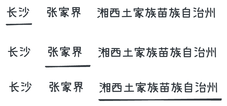
- 设置 indicator 为 Tab 的绝对定位
absolute - 计算和保存每一个 Tab item 宽度和位置,这是最难的部分
- 根据 Tab item 宽度数组与当前选中的 Tab item index,计算 indicator 的位置
left和width
通过 layoutId,我们可以很容易实现上面的动画。
function KFTabs({ options }: KFTabsProps) {
  const [currentValue, setCurrentValue] = useState(options[0].value);

  return (
    <div className='kf-tabs'>
      {options.map((item) => {
        return (
          <div
            key={item.value}
            className={classNames('kf-tabs__item', {
              'kf-radio-group__item--active': currentValue === item.value,
            })}
            onClick={() => {
               setCurrentValue(item.value);
            }}
          >
            <div className={'kf-tabs__item__label'}>{item.label}</div>
            {currentValue === item.value && (
              <motion.div
                layoutId="indicator"
                className={'kf-tabs__item__indicator'}
                initial={false}
                transition={{ duration: 0.3, ease: 'easeInOut' }}
              ></motion.div>
            )}
          </div>
        );
      })}
    </div>
  );
}
2
3
4
5
6
7
8
9
10
11
12
13
14
15
16
17
18
19
20
21
22
23
24
25
26
27
28
29
30
31
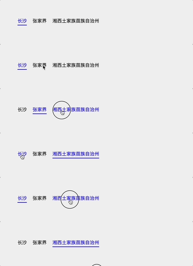
不在需要每一个 Tab item 宽度和位置。
它的原理是当添加新组件的 layoutId 属性与现有组件的 layoutId 匹配时,它将自动从旧组件中动画出来。
# 小贴士
为了在可滚动容器中正确地设置 Layout 动画,必须将 layoutScroll 属性添加到可滚动元素中。
<motion.div layoutScroll style={{ overflow: "scroll" }} />
为了在固定元素中正确地设置 Layout 动画,必须将 layoutRoot 属性添加到固定元素中。
<motion.div layoutRoot style={{ position: "fixed" }} />
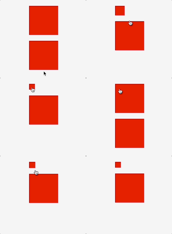
由于性能原因,当一个组件执行 Layout 动画时,其它的组件将无法检测到其布局的变化。
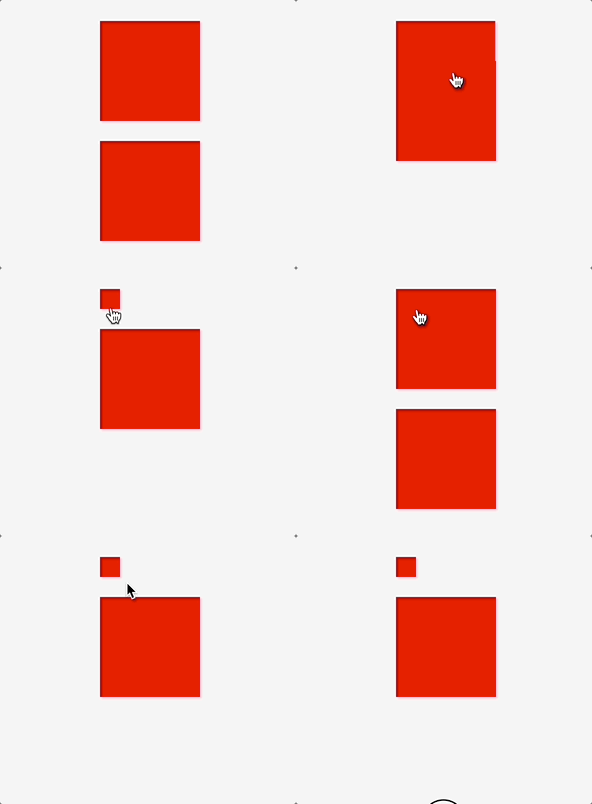
但是可以通过在 LayoutGroup (opens new window) 组件中包装多个组件来同步布局更改。
import { LayoutGroup } from "motion/react"

function List() {
  return (
    <LayoutGroup>
      <Accordion />
      <Accordion />
    </LayoutGroup>
  )
}
2
3
4
5
6
7
8
9
10
# 滚动动画
Motion 的滚动动画有两种类型:
- Scroll-triggered:当元素进入或离开 viewport(视口)时触发动画。
- Scroll-linked:与滚动进度关联的动画。
# Scroll-triggered
Scroll-triggered 是元素进入或离开 viewport(视口)时触发的动画。Motion 组件通过 whileInView 设置动画目标或 variant 实现这样的动画。
<motion.div
  initial={{ opacity: 0 }}
  whileInView={{ opacity: 1 }}
/>
2
3
4
# 进入与离开
要很好的实现 Scroll-triggered 动画,首先要了解 Motion 怎么定义组件的“进入”与“离开”
这里我要做一个组件显示时,transformY(100) => transformY(0) 的动画
const variants: Variants = {
  visible: {
    y: 0,
  },
  hidden: {
    y: 100,
  },
};

<motion.div
  variants={variants}
  initial={'hidden'}
  whileInView="visible"
/>
2
3
4
5
6
7
8
9
10
11
12
13
14
假设元素的 top 为 1000px,组件的高度是 100px,那么组件处于 1000px ~ 1099px。
当视口滚动到哪个位置,组件是被视为”进入“?
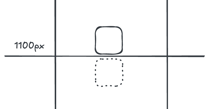
根据我的测验,当视口底部滚动到 1100px,组件才被视为”进入“,即:
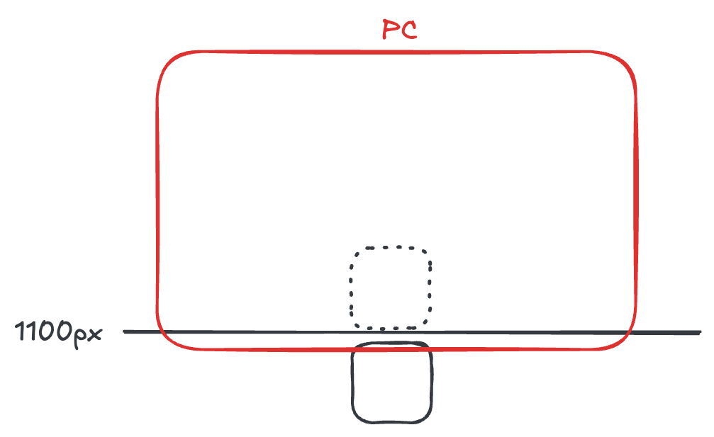
可以这么理解,一开始因为设置 initial="hidden",组件执行了 transformY(100),此时组件处于 1100px ~ 1199px。只有滚动到这个区间时,才能看到组件。
那当视口滚动到哪个位置,组件是被视为”离开“?
“离开”分为两种:
- 显示组件后,调转方向往上滚动,当视口底部滚动到
999px时,组件被隐藏在屏幕下方 - 或者继续往下滚动,当视口顶部滚动到
1100px时,组件被隐藏在屏幕上方
即:
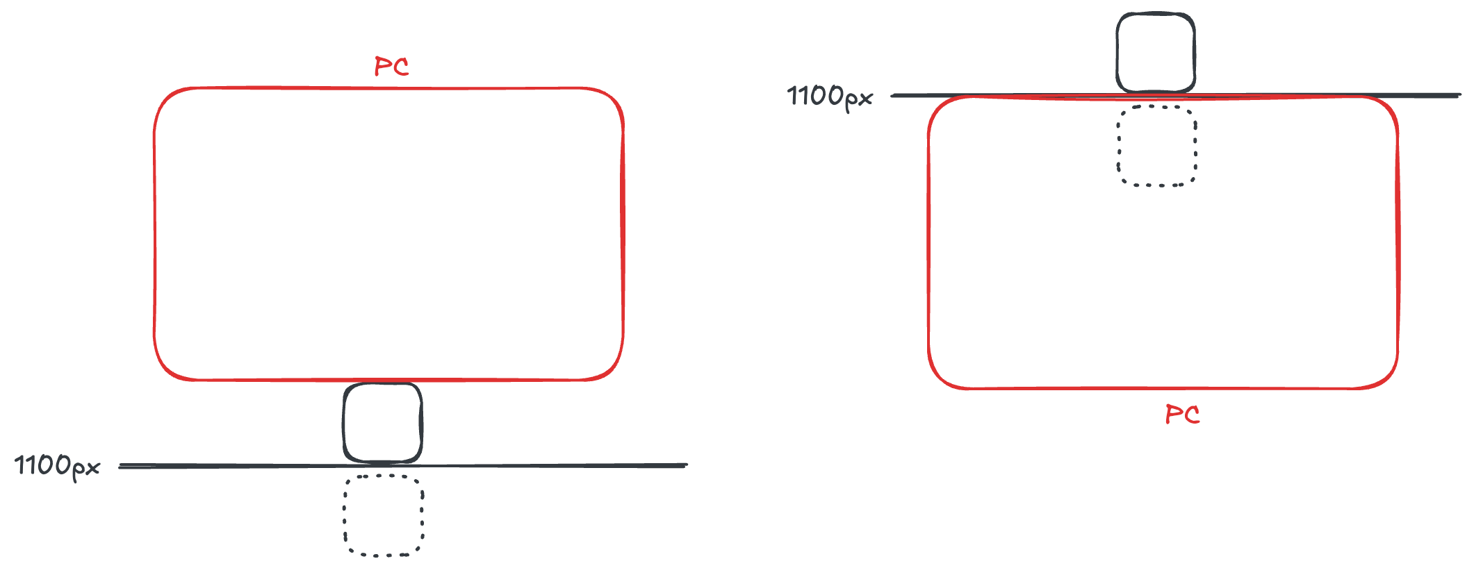
搞清楚组件的“进入”与“离开”后,我们就能发现上面代码的问题,这也是 Motion 组件的典型问题:
如右图所示:屏幕继续往下滚动,当视口顶部滚动到 1100px 时,组件被视为“离开”,“离开”时,Motion 会执行 initial="hidden" 定义的动画,执行transformY(100),组件下移 100px, 此时组件又“进入”了视口,Motion 将执行 whileInView="visible" 定义的动画,执行 transformY(0),组件上移 100px,组件又“离开”了视口,从而产生了循环动画,导致组件“闪烁”。
# 解决方案
方案一: 对于纵向滚动来说,不要设计 transformY 的动画,可以改为 transformX 或者 scale 这种纵向位置不变的动画。
const variants: Variants = {
  visible: {
    x: 0,
    opacity: 1,
    transition: {
      ease: 'easeInOut',
      duration: 0.5,
    },
  },
  hidden: {
    x: -100,
    opacity: 0,
  },
};
2
3
4
5
6
7
8
9
10
11
12
13
14
方案二: 设置 viewport (opens new window) 的 once 为 true,只做一次进入动画。
<motion.div
  variants={variants}
  initial={'hidden'}
  whileInView="visible"
  viewport={{ once: true }}
/>
2
3
4
5
6
方案三: 如果设计师硬性要求必须做 transformY 动画,可以使用嵌套结构。
保持父组件的位置不动,移动子组件,父组件能正确识别“进入”与“离开”
const parentVariants: Variants = {
  visible: {
    overflow: 'visible',
  },
  hidden: {
    overflow: 'hidden',
  },
};

const variants: Variants = {
  visible: {
    y: 0,
    transition: {
      ease: 'easeInOut',
      duration: 0.5,
    },
  },
  hidden: {
    y: 100,
  },
};

<motion.div
  initial='hidden'
  whileInView="visible"
  variants={parentVariants}
  className="parent"
>
  <motion.div variants={variants} className="child" />
</motion.div>
2
3
4
5
6
7
8
9
10
11
12
13
14
15
16
17
18
19
20
21
22
23
24
25
26
27
28
29
30
样式
.parent {
  width: 100px;
  height: 100px;
  position: relative;
}

.child {
  position: absolute;
  top: 0;
  height: 100%;
  left: 0;
  width: 100%;
}
2
3
4
5
6
7
8
9
10
11
12
13
方案四: 根据滚动方向设置“离开”时的 Y 偏移。这是最推荐的解决方案。
上面提到的问题,其实是向下滚动,导致组件在屏幕上方“离开”,执行“离开”动画,组件下移 100px,导致组件又“进入”了。如果此时组件不是下移 100px,而是上移 100px,就不会有问题了。因此我们需要根据滚动方向设置“离开”时的 Y 偏移。
首先自定义 hook,获取滚动方向。
我们使用两个 Motion hook:useScroll 和 useMotionValueEvent,很容易获取滚动方向。
import { useMotionValueEvent, useScroll } from 'motion/react';
import { useState } from 'react';

export const useScrollDirection = () => {
  const [scrollDirection, setScrollDirection] = useState('up'); // 默认值必须为 'up'
  const { scrollY } = useScroll();

  useMotionValueEvent(scrollY, 'change', (current) => {
    const diff = current - (scrollY.getPrevious() || 0);
    setScrollDirection(diff > 0 ? 'down' : 'up');
  });

  return scrollDirection;
};
2
3
4
5
6
7
8
9
10
11
12
13
14
向下滚动导致组件在屏幕上方“离开”时,transformY(-100px),向上滚动导致组件在屏幕下方“离开”时,transformY(100px)。
初始时需要 transformY(100px),所以 direction 的默认值是 'up'。
const direction = useScrollDirection();
const variants: Variants = {
  visible: {
    y: 0,
    transition: {
      ease: 'easeInOut',
      duration: 0.5,
    },
  },
  hiddenDown: {
    y: 100,
  },
  hiddenUp: {
    y: -100,
  },
};

<motion.div
  id="test"
  initial={direction === 'down' ? 'hiddenUp' : 'hiddenDown'}
  whileInView="visible"
  variants={variants}
/>
2
3
4
5
6
7
8
9
10
11
12
13
14
15
16
17
18
19
20
21
22
23
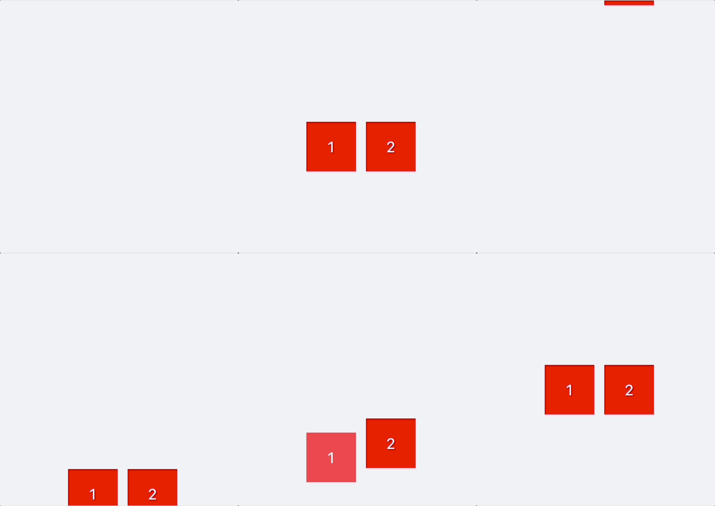
实现效果如下,方块 1 使用了 Scroll-triggered,方块 2 作为参照物。Scroll-triggered 动画如此丝滑。
方案五: 使用 useInView (opens new window) + useAnimate (opens new window) 自定义 Scroll-triggered 动画
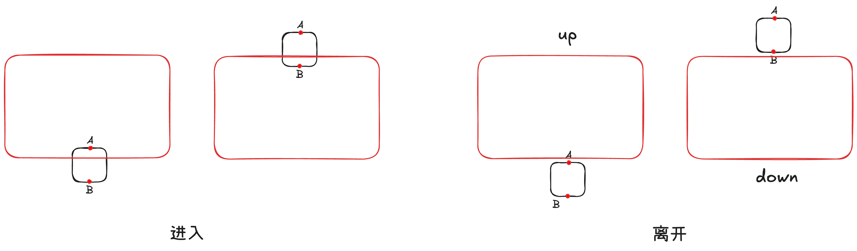
解决思路:在组件顶部和底部添加两个标记点 A 和 B:
- 当 A 进入且 B 离开,或者当 B 进入且 A 离开,执行
"visible"动画 - B 先于 A 离开,
"direction"标记为"up" - A 先于 B 离开,
"direction"标记为"down" - 当 A 和 B 都离开,执行
"hidden"动画。"direction"为"up"时,下移,反之上移
首先封装一个组件 TransformWrapper
type TransformWrapperProps = {
  y: number; // Y 偏移量
  children: React.ReactNode;
};

function TransformWrapper({ y, children }: TransformWrapperProps) {
  const topRef = useRef<HTMLDivElement>(null);      // 顶部的标记点
  const bottomRef = useRef<HTMLDivElement>(null);   // 底部的标记点
  const isTopInView = useInView(topRef);            // 顶部的标记点是否可见
  const isBottomInView = useInView(bottomRef);      // 底部的标记点是否可见
  const [direction, setDirection] = useState('up'); // 默认值同样是 "up"
  const [scope, animate] = useAnimate();

  useEffect(() => {
    // 执行 visible 动画
    if ((isTopInView && !isBottomInView) || (!isTopInView && isBottomInView)) {
      animate(
        scope.current,
        {
          opacity: 1,
          y: 0,
        },
        { duration: 0.5, ease: 'easeInOut' },
      );
    } else if (!isTopInView && !isBottomInView) {
      // 执行 hidden 动画
      animate(
        scope.current,
        {
          opacity: 0,
          y: direction === 'down' ? -y : y, // 根据滚动方式确定是上移还是下移
        },
        { duration: 0.5, ease: 'easeInOut' },
      );
    }
  }, [isTopInView, isBottomInView, direction]);

  useEffect(() => {
    if (!isBottomInView && isTopInView) {
      setDirection('up');
    } else if (!isTopInView && isBottomInView) {
      setDirection('down');
    }
  }, [isTopInView, isBottomInView]);

  return (
    <div className={styles['container']} ref={scope}>
      <div className={styles['container__top']} ref={topRef}></div>
      <div className={styles['container__bottom']} ref={bottomRef}></div>
       {children}
    </div>
  );
}

export default TransformWrapper;
2
3
4
5
6
7
8
9
10
11
12
13
14
15
16
17
18
19
20
21
22
23
24
25
26
27
28
29
30
31
32
33
34
35
36
37
38
39
40
41
42
43
44
45
46
47
48
49
50
51
52
53
54
55
样式
.container {
  position: relative;

  &__top {
    position: absolute;
    top: 0;
    left: 0;
    width: 100%;
    height: 2px;
  }

  &__bottom {
    position: absolute;
    bottom: 0;
    left: 0;
    width: 100%;
    height: 2px;
  }
}
2
3
4
5
6
7
8
9
10
11
12
13
14
15
16
17
18
19
使用
<TransformWrapper y={100}>
  <div></div>
</TransformWrapper>
2
3
# 配置
Motion 组件可以通过 viewport (opens new window) 定义其行为
# root
Motion 组件默认的滚动容器是 window,通过 root 可以是设置滚动容器
function Component() {
  const scrollRef = useRef(null);

  return (
    <div ref={scrollRef} style={{ overflow: "scroll" }}>
      <motion.div
        initial={{ opacity: 0 }}
        whileInView={{ opacity: 1 }}
        viewport={{ root: scrollRef }}
      />
    </div>
  )
}
2
3
4
5
6
7
8
9
10
11
12
13
# once
如果 true ,则只做一次进入动画。
# amount
组件进入视口的比例,只有达到该比例才算“进入”。值为 "some"、 "all" 或 0 ~ 1 的数字。"some" 表示 0, "all" 表示 1。默认值为 "some" 。
# margin
添加到视口的边距,用于改变检测区域。默认值为 "0px" 。使用多个值可以调整上/右/下/左边距,例如 "0px -20px 0px 100px" 。
# Scroll-linked
Scroll-linked 根据滚动进度执行动画。
useScroll (opens new window) hook 返回四个 Motion Value (opens new window)。
scrollX/scrollY:滚动距离,单位为像素scrollXProgress/scrollYProgress:滚动进度,0 ~ 1
# Motion Value
Motion Value 是 Motion 提供的一种特殊类型,可以追踪动画值的状态和速度。
# useMotionValue
Motion 使用 useMotionValue (opens new window) 创建一个 Motion Value
const value = useMotionValue(0);
通过 get() 获取最新状态,set() 方法设置为新状态
将 MotionValue 作为 Motion 组件的子元素,每当 MotionValue 更新, Motion 组件将渲染最新的值。
这比设置 React state 更高效,因为更新 MotionValue 将直接更新 DOM,而不是导致 React 重新渲染。
下面是使用 Motion Value 创建一个计数器的动画
import { useMotionValue, motion, animate } from "motion/react"

function Counter() {
  const count = useMotionValue(0);

  useEffect(() => {
    const controls = animate(count, 100, { duration: 5 })
    return () => controls.stop()
  }, []);

  return <motion.pre>{count}</motion.pre>
}
2
3
4
5
6
7
8
9
10
11
12
使用 useMotionValue 创建的 Motion Value 不具有动画性
const value = useMotionValue(0);
// 直接设置成 100,没有动画效果
value.set(100);
2
3
可以使用 animate 动态修改 Motion Value。或者使用 useSpring。
# useSpring
useSpring (opens new window) 创建一个 Motion Value,并使用 spring 动画显示其最新值。
const value = useSpring(0);
// 以 spring 动画到 100
value.set(100);
// 跳过动画,直接设置 100
value.jump(100);
2
3
4
5
useSpring (opens new window) 还能跟踪另一个 Motion Value,并使用 spring 动画到另一个 Motion Value 的最新值。
const x = useMotionValue(0);
const y = useSpring(x);

// y 都会通过 spring 动画到 100
x.set(100)
y.set(100)
2
3
4
5
6
# useTransform
useTransform (opens new window) 转换一个或多个 Motion Value。
它有两种转换方式:
- 转换函数
const x = useMotionValue(1);
const y = useMotionValue(1);
const z = useTransform(() => x.get() + y.get()); // z.get() === 2
2
3
在转换函数中,通过 get 方法读取的任何 Motion Value 都将被自动订阅。当这些 Motion Value 改变时,在下一个动画帧中再次运行转换函数,计算新值。
- 映射
const x = useMotionValue(0);
const opacity = useTransform(x, [-100, 0, 100], [0, 1, 0]);
2
# useMotionTemplate
useMotionTemplate (opens new window) 通过字符串模板创建 Motion Value
const x = useMotionValue(100);
const transform = useMotionTemplate`transform(${x}px)`;
2
# useMotionValueEvent
Motion Value 有下列这些事件
changeanimationStartanimationCancelanimationComplete
可以通过 on 方法订阅这些事件
const x = useMotionValue(100);
const unsubscribe = x.on("change", latest => console.log(latest));
// 取消订阅
unsubscribe();
2
3
4
但是更方便的方式是使用 useMotionValueEvent (opens new window)
useMotionValueEvent(x, "change", (latest) => {
  console.log("x changed to", latest)
})
2
3
# 首页 Banner 动画
Scroll-linked 动画跟 Motion Value 的使用密不可分,Motion - Scroll-linked Animations (opens new window) 上提供了多个 Scroll-linked 的示例。
这里我们将使用 Scroll-linked 实现首页 Banner 动画
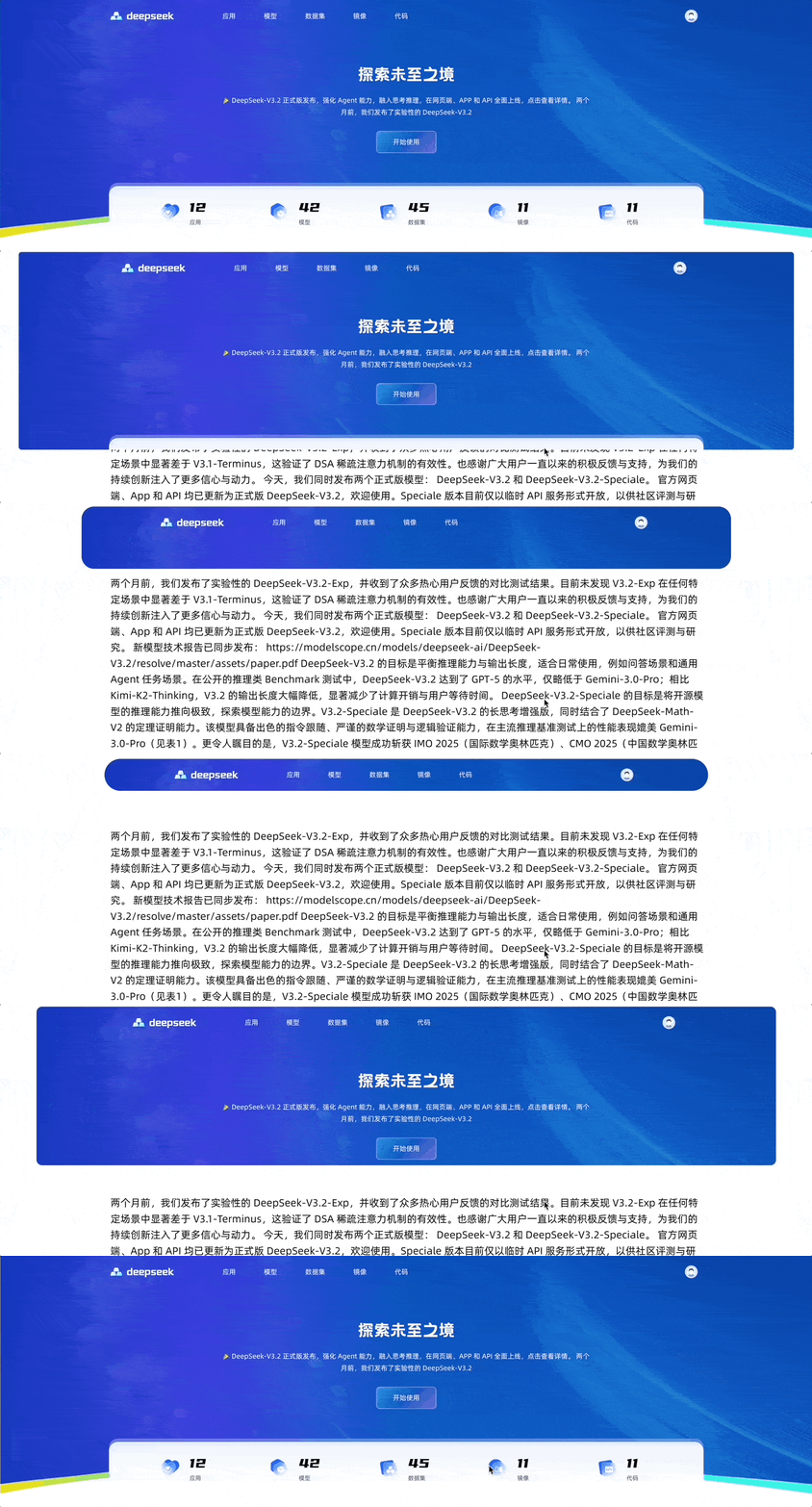
实现思路:
- 首先获取 Y 轴滚动距离
scrollY - 通过
useSpring得到一个 spring 动画版的springScrollY - 根据
springScrollY,使用useTransform计算 height、left、right、top、radius、padding 等值 - 因为我使用 rem,响应式布局,使用
useMotionTemplate转换为 rem - 使用
useMotionValueEvent,判断滚动距离,切换背景图
function HomeBanner() {
  const [minBgImage, setMinBgImage] = useState(undefined);
  const [largeBgImage, setLargeBgImage] = useState(headerImage);
  const { scrollY } = useScroll();
  const springScrollY = useSpring(scrollY, {
    stiffness: 100,
    damping: 30,
    restDelta: 0.001,
  });

  const initialHeight = convertRemToPx(35); // rem 转 px
  const minHeight = convertRemToPx(4.7); // rem 转 px
  const height = useTransform(() => `max(calc(35rem - ${springScrollY.get()}px), 4.7rem)`);
  const inline = useTransform(springScrollY, [0, initialHeight], [0.0, 16.25]);
  const inlineRem = useMotionTemplate`${inline}rem`;
  const radius = useTransform(springScrollY, [0, initialHeight], [0.0, 2.5]);
  const radiusRem = useMotionTemplate`${radius}rem`;
  const top = useTransform(springScrollY, [0, initialHeight], [0, 10]);
  const paddingInline = useTransform(springScrollY, [0, initialHeight], [16.25, 10]);
  const padding = useMotionTemplate`1.25rem ${paddingInline}rem 0`;

  useMotionValueEvent(scrollY, 'change', (value) => {
    setMinBgImage(value > initialHeight - minHeight ? miniHeaderImage : undefined);
    setLargeBgImage(value > initialHeight - minHeight ? undefined : headerImage);
  });

  return (
    <motion.div
      className={styles['home-banner']}
      style={{
        height: height,
        left: inlineRem,
        right: inlineRem,
        borderRadius: radiusRem,
        top: top,
        backgroundImage: minBgImage ? `url(${minBgImage})` : undefined,
      }}
      transition={{
        type: 'spring',
        duration: 0.3,
      }}
    >
      <motion.div
        className={styles['home-banner__content']}
        style={{
          padding: padding,
          backgroundImage: largeBgImage ? `url(${largeBgImage})` : undefined,
        }}
      >
        <NavBar></NavBar>
        <Intro></Intro>
        <StatisticsBlock></StatisticsBlock>
      </motion.div>
    </motion.div>
  );
}
2
3
4
5
6
7
8
9
10
11
12
13
14
15
16
17
18
19
20
21
22
23
24
25
26
27
28
29
30
31
32
33
34
35
36
37
38
39
40
41
42
43
44
45
46
47
48
49
50
51
52
53
54
55
56
样式
.home-banner {
  position: fixed;
  top: 0;
  right: 0;
  left: 0;
  z-index: 100;
  height: 35rem;
  overflow: hidden;
  background-color: transparent;
  background-repeat: no-repeat;
  background-position: left top;
  background-size: 100% 100%;

  &__content {
    position: relative;
    z-index: 10;
    display: flex;
    flex-direction: column;
    align-items: center;
    padding: 1.25rem 16.25rem 0;
    background-repeat: no-repeat;
    background-position: left top;
    background-size: 100% 100%;
  }
}
2
3
4
5
6
7
8
9
10
11
12
13
14
15
16
17
18
19
20
21
22
23
24
25
# References
- Motion Docs (opens new window)
- Motion Examples (opens new window)
- Motion Component (opens new window)
- Motion AnimatePresence Component (opens new window)
- Motion Transitions Props (opens new window)
- Motion Easing Functions (opens new window)
- Motion Drag Animation (opens new window)
- Motion Layout animation (opens new window)
- Motion Variants (opens new window)
- Motion values overview (opens new window)
- MDN -
<easing-function>(opens new window) - Easing Functions Cheat Sheet (opens new window)
- Cubic Bezier (opens new window)
- MDN - Web Animations API (opens new window)
- View Transition API (opens new window)
- Blog - Animations on the Web (opens new window)
- Blog - Inside Framer's Magic Motion (opens new window)